
An interesting yet challenging concept in data analysis is the scatter plot. What is a scatter plot? And when do we use it? A scatter plot is a way two visualize the relationship between two variables. In a scatter plot or scatter graph, dots are used to represent the values of two different numeric variables. The values of each dot on the horizontal and vertical axis correspond to separate data points.
Scatter plots are used to determine the relationship between two variables. Each point in a scatter plot not only provides details of an individual data point but can also be used to identify and defined patterns when the data set is considered as a whole.
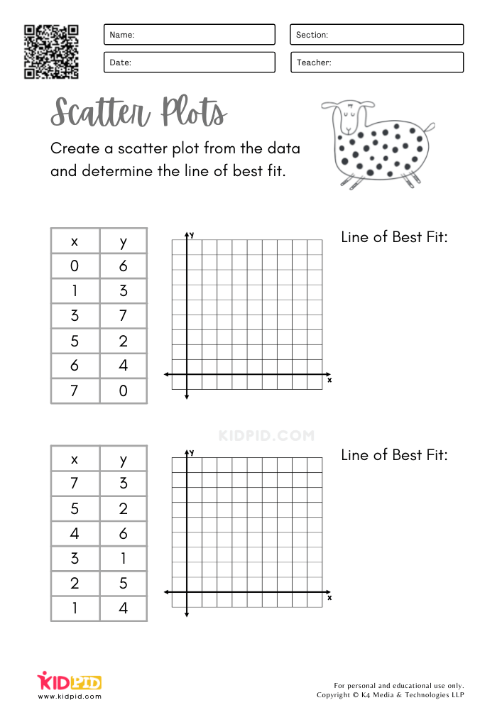
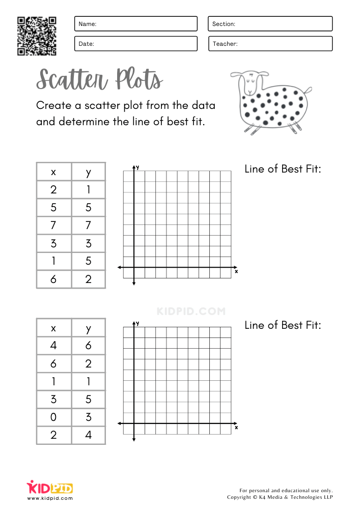
Our task here is to plot the set of values given and determine the line of best fit. The best fit is nothing but the line that best represents the trend between the variables of the scatter plot.
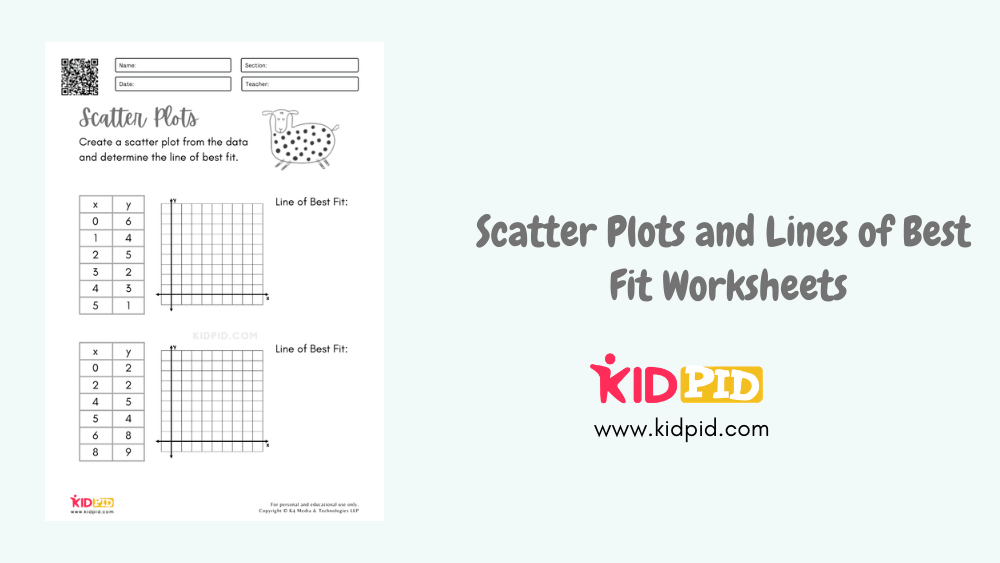
Scatter Plots and Lines of Best Fit Worksheets

Let’s take a look at the first plot and try to understand a little bit about how to plot the line of best fit. Now, if you notice, as the values of x increase, the values for why progressively decrease.
There is only one exception for x = 2. However, other than that, the overall trend or pattern for the graph is that for y decrease as increases. The line of best fit can thus be accordingly plotted.

Be careful while plotting the values on the coordinates. Incorrect plotting can produce a plot or graph that completely misrepresents the relationship between the variables.
Understanding the logic and concept behind a scatter plot can take some time. Practice will help one understand the basic idea behind plotting values on a graph and finding the correlation between the plotted values visually.

The point of learning scatter plots is to be able to apply them to real-life problems and draw appropriate conclusions according to the value obtained. So, before moving on to the more complex applicative problems, solving worksheets like this will help one understand and master the underlying concept.

Once familiar with the basic steps and idea behind a scatterplot, try solving each worksheet on a fixed time- limit. This will push learners to solve problems faster and help them become more efficient at solving such problems.
Scatter plots are relevant tools necessary for understanding and solving data analysis problems. In order to be able to apply this concept to real-world problems and draw conclusions, it is essential to first have a good grip over the basic concept. And what better way to tackle concepts than through fun and interactive worksheets?
So, what are you waiting for?
Download your favourite worksheets, print them out and get started today!
This worksheet is created by our Content Team to encourage academic growth.


