Bar charts represent data in rectangular bars with different heights according to the variation of the data. This is a bar chart worksheet for third-grade students to analyze the bar graph data and answer the given questions in the worksheet. So, check out these worksheets and enhance your knowledge about bar charts. Enjoy the activity and boost your skills.
Create a Scaled Bar Graph Worksheet for Grade 3
[Scroll Down for Download Link]
Read More: Interpret Data Printable Worksheets for Grade 1

Q. Which student’s score would be shown with the shortest bar?
Ans. Calf
Q. What is Lisa’s exam score?
Ans. 12
Q. If you were to draw a bar graph, whose bar would be the tallest?
Ans. Petter
Q. How many more points did Peter score than Dora?
Ans. 6
This is a bar chart worksheet where the students will practice learning the bar charts. Four students recorded their exam scores. After analyzing the data, they have to create a bar chart and answer the questions given in the worksheet based on the bar chart.
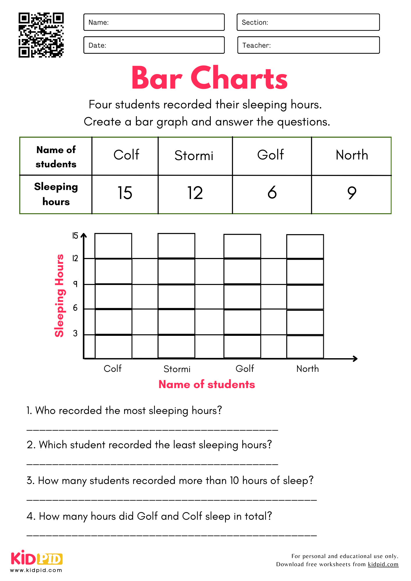
Q. Who recorded the most sleeping hours?
Ans. Colf
Q. Which student recorded the fewest sleeping hours?
Ans. Golf
Q. How many students recorded more than 10 hours of sleep?
Ans. 2
Q. How many hours did Golf and Colf sleep in total?
Ans. 21
In this bar chart worksheet, students will practice creating a bar chart. Four students recorded their sleeping hours. After analyzing the data, they have to create a bar chart and answer the questions given in the worksheet based on the bar chart.
Key Facts About Scaled Bar Graphs
- Definition: Unlike standard bar graphs, where one square represents one unit, a scaled bar graph uses a “scale” where one unit can represent multiple items (e.g., 2, 5, or 10).
- Purpose: They allow us to display large sets of data in a compact, easy-to-read format.
- Grade Level: A core competency for 3rd-grade mathematics (aligned with standards like 3.MD.B.3), helping students bridge the gap between simple counting and multiplication/division logic.
- Visual Anchor: The scale acts as a visual anchor that requires skip-counting to interpret correctly.
Parts/Types/Examples of Scaled Bar Graphs
- Parts of a Graph:
- Title: Tells the reader what the data is about.
- Categories: The items being compared (e.g., Apple, Banana, Orange).
- Axes: The horizontal (x) and vertical (y) lines. One displays categories; the other displays numerical values.
- Scale: The interval or “skip-count” value used on the axis (e.g., 0, 5, 10, 15).
- Types:
- Vertical Bar Graphs: Bars rise upward from the horizontal axis.
- Horizontal Bar Graphs: Bars stretch sideways from the vertical axis.
- Examples: Tracking favorite sports, classroom book counts, or daily temperatures.
How Does a Scaled Bar Graph Work?
A scaled bar graph works by using multiplication to represent data.
- Identify the Scale: Look at the numbers on the axis. If they count by 2s, 4s, 6s, 8s, every unit represents 2.
- Measure the Height/Length: See where the bar ends. If the bar ends on the “4” mark and the scale is 1 unit = 5, you multiply: 4 x 5 = 20.
- Interpret Data: This allows us to compare “how many more” or “how many fewer” items exist between two categories without having to count hundreds of individual boxes.
Benefits of Learning About Scaled Bar Graphs
- Mathematical Fluency: It strengthens skip-counting and basic multiplication skills.
- Data Literacy: It prepares students to understand graphs they encounter in real life (news, science, business).
- Critical Thinking: It moves students beyond simple identification to solving two-step word problems (e.g., “If we combine Category A and B, what is the total?”).
Learning Objectives
By the end of this worksheet, students will be able to:
- Identify the scale of a bar graph.
- Read and interpret data represented by bars that do not align with a 1:1 count.
- Create their own scaled bar graphs from a data set.
- Solve one- and two-step “how many more” and “how many total” problems using visual data.
Worksheet Instructions
- Examine the Title: Start by understanding what the graph is measuring.
- Check the Scale: Always look at the vertical or horizontal axis to see what each gridline represents.
- Analyze the Bars: Use a ruler or your finger to track the end of the bar to its corresponding value on the axis.
- Read the Questions: Look for keywords like “total,” “difference,” “more than,” or “fewer than” before calculating.
- Double-Check: If the question asks for a total, ensure you have added the values of all required categories.
Vocabulary
- Scale: The interval used to count (e.g., skip-counting by 5s).
- Axis: The reference line for measurement (Vertical = up/down; Horizontal = side-to-side).
- Data: A collection of facts or numbers gathered for analysis.
- Interval: The numerical distance between two markings on an axis.
- Interpretation: The process of making sense of the information presented visually.
Real-Life Applications
- Shopping: Comparing the prices of different items using scaled values.
- Weather: Tracking monthly rainfall, where each unit represents multiple millimeters of water.
- Sports: Seeing how many goals a team scored over several weeks, where one bar might represent 10 goals.
- Surveys: Analyzing school cafeteria feedback to see which lunch options are most popular.
FAQs
Q1. Why don’t we just use 1:1 graphs?
Answer: If you had to graph 100 items using a 1:1 scale, your paper would be too small! Scaling makes big data fit on one page.
Q2. My child gets the right numbers but misses the “how many more” questions. What should I do?
Answer: Have them write the numerical value above each bar before answering the word problems. It keeps the data organized.
Q3. Is it better to start with a scale of 2 or 10?
Answer: Start with a scale of 2. It mimics the skip-counting skills most 3rd graders are currently perfecting in class.
Master scaled bar graphs with this Grade 3 worksheet designed to strengthen data interpretation skills. Students learn to read, compare, and analyze scaled graphs while improving mathematical reasoning and problem-solving confidence. Unlock fun learning opportunities with printable quizzes, paragraphs, worksheets, essays, flashcards, and interactive resources. Follow us on YouTube, Telegram, and Facebook.
This worksheet is designed by our Content Team to support quality learning experiences.
Reviewed By Swati
Read More: